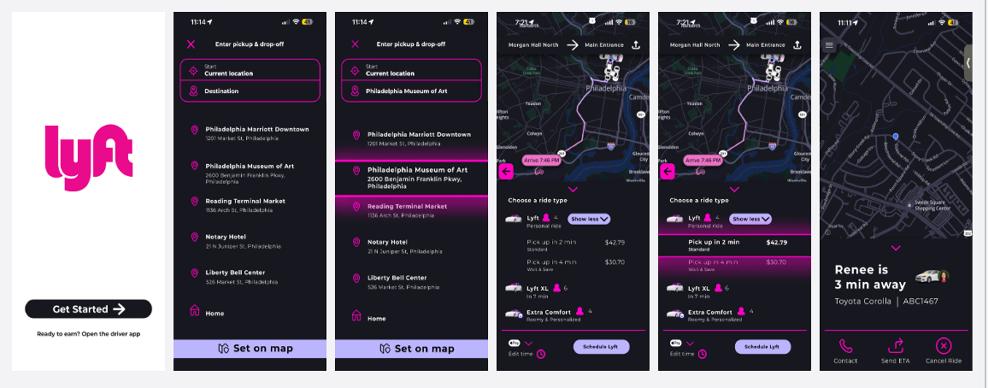

Doordash v. Grubhub, Instagram Reels v. Tik Tok, and of course, our main core idea for this project, Uber v. Lyft
Why do we choose one app over the other? Could it be habit or usability? Or maybe it's the cost that causes us to choose differently? Perhaps, simply the aesthetic or look of the interface influences our decision to choose one competitor.
These questions were the focus of our user experience research and see why some people favor one over the other. Based on the insights we gained, we visualized possible solutions to enhance the user experience with Lyft.
Full Case Study coming soon!
Tools Used: Figma, Google Forms
Instructor: Sara Hall
Team Members: Olivia Biordi, Ash Renk